The tree map divides data into segments according to size and color. The size of each segment is driven by the value (the larger the value, the larger the segment), while the color is driven by the member hierarchy in the Color drop zone.
Build a Tree Map Chart
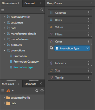
Add your measure to Values, and your member hierarchy to Color.
You can segment the tree map further by adding a second member to Details, as in the example below.
Examples
Example 1
Step 1
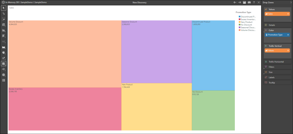
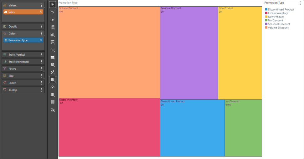
Using the Sample Demo model, add the Promotion Type hierarchy to the Color drop zone;
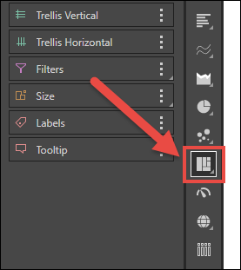
Step 2
select the Tree Map Chart from the visualization menu.
Step 3
Add the Sales measure to the Values zone.
Step 4
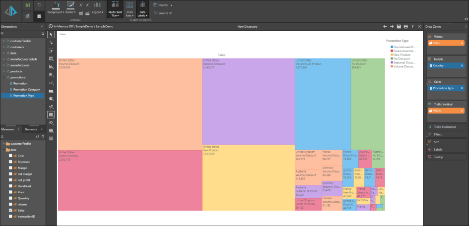
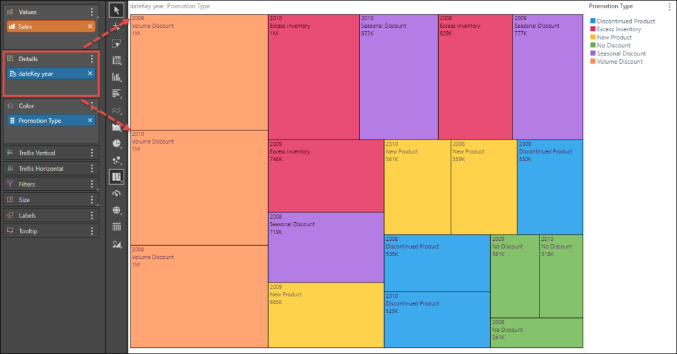
Add the dateKey year hierarchy to the Details zone to display a breakdown by year.
Step 5
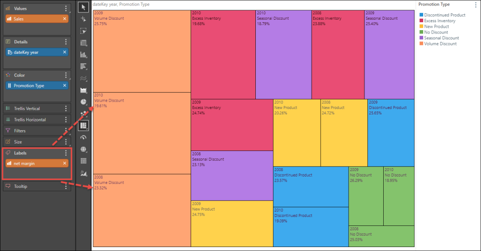
Add the Net Margin measure to the Labels zone, to display the net margin in each segment.
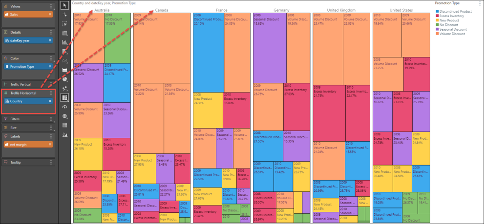
Example 2
This example continues on from Example 1, adding more advanced functionality.
Step 1
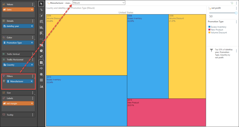
Add the Country hierarchy to the Trellis Vertical zone, to display a separate chart for each country.
Step 2
Using the Net Profit measure, create a top percent numeric filter. To do this, drag the Net Margin measure over the Filters zone; from the submenu go to Data Filters, then drop the measure chip onto Top Percent from the next submenu.
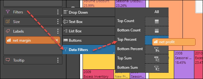
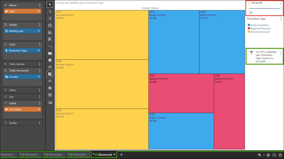
The resulting filter (green highlight below) and slider (red highlight) will be displayed on the canvas:
Step 3
Add the Manufacturer hierarchy to the filters zone, and use the resulting slicer to select the required manufacturer.